
Icons are everywhere.
Thousands are created everyday, by hundreds of websites, from all over the world. Simply type “icons” into Google and watch your screen fill with pages of different websites offering different icon sets with different styles, colors, and formats.
A typical app needs 10-20 icons. Aside from your usual suspects used for things like “settings” and “edit”, each of your projects will often require unique icons.
Herein lies the problem, however.
Let’s say your app needs 15 icons. You browse around the internet looking at the many options available for acquiring icons and start pulling all the ones you like. Odds are you’ll have icons that are different styles, colors, and sizes.
This does not make your app look good. Simply adding them as is is not a good idea.
So how are you able to use the icons that you like, even if they are from different designers and don’t really fit together with one another? How do you keep things consistent and looking sharp?
The easiest and quickest way (simple is typically best, I always tend to think) to accomplish this is by making sure your icons all have uniform size and color.
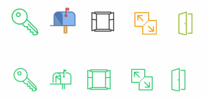
If you’re feeling brave you can try to edit the icons on your own. But if that’s too daunting or too tedious, some websites allow you to change simple properties like color right on them.
Simplicity is bliss.
Now let’s move on to style. Whereas colour and size can be manipulated easily enough, style is a whole other story.
There’s little way around it, for style you just have to choose whether you want all your icons to be in either a flat design, or skeuomorphism. And for those of you who have been living under a rock in recent years, the battle between these two different design styles has been raging fiercely.
Skeuomorphism creates a sense of familiarity by emulating materials, while flat design stays true to its medium, often feeling minimal and utilitarian. People sometimes think that skeuomorphism feels disingenuous and inauthentic, while many others feel that flat design is boring and maybe too minimal.
But really the choice is up to you. The only thing we ask is that you go all in with one or the other. Combining flat and skeuo icons leads to a messy interface, wrong accents and, sometimes, total disregard of buttons as “buttons”. You don’t want any of those things.
So what’s the lesson here?
If your goal is consistency, only combine icons that were designed for the same operating system. Keep flat design and skeuo icons completely separate, and make the colors and sizes as uniform as possible. And if you do use icons from different sets or different sub styles, have an experienced designer look them over and see how they feel about them.
Another important aspect related to color and style is light.
Take a look at these two icons:

The difference in lighting is a dead giveaway that you got these icons from two different sets. One looks like it’s sitting on a beach in Mexico with the sun beating down on it, and the other looks like it’s in Russia in the middle of winter.
In order to keep everything uniform, you need to be aware of how much light, the direction of the light, and the shadows for each of your icons. All of these elements need to either be the same or you need to get rid of them. Either everyone is on the beach in Mexico, or everyone is experiencing the Russian winter.
Okay, now let’s move on to visual weight.
In short, the purpose of visual weight is to balance out how the user will view your page. If you are combining icons from different sets it’s critical that you keep this concept in mind. You need to make sure that all your icons appear (or are perceived to appear) to have comparable size, density and weight.
See a more in-depth discussion of visual weight here.
From color, to style, to light, to weight–all of it really boils down to paying attention to detail. If you’re combining icons from different sets you need to take a step back, and objectively ask yourself whether they go together or not. Do they look as if they could have been created by the same designer?
The devil is in the details, as they say.
So in addition to the things discussed above you just have to mindful of the other little details. For example, if you add a pixelated element to the corner of a couple of your icons, make sure you add it to all of them. If you add multiple icons to a picture, be sure that the background area behind each icon is consistent. If you have some complex icons, see to it that all of your icons are complex.
Remembering these little things will keep you out of trouble and keep your icons looking good.
Icons should look as if they are a part of a one panel, interface. Don’t forget that first icons were used in “offline” interfaces, and our perception of them in the “digital” world is hugely affected by this fact. Consistency is everything.
And I mean everything.
An experienced designer decides whether icons fit together or not almost intuitively, and the list of possible attributes (shadows, styles, lines) can be endless. However, in this article I tried to pinpoint the most important, and often ignored ones, so we all could become better at “gathering” our interfaces.
So get out there and start combining icons! If you have any questions or tips to add, feel free to head to the comments section!